My first website created from scratch
28 November, 2019
6 minute read

Live Version

View Code
I’m an artist, an art teacher, and during my training in university I've learned art, design and coding in HTML and CSS. After I’ve started to learn the modern HTML5, CSS3 and Javascript e needed to create a project from scratch. And that project had to be my own website.
Since I’ve had experience creating some projects during my time in university, and even after that for some years, (wordpress, blogger and flash), this was a way to step up my knowledge and create better websites.
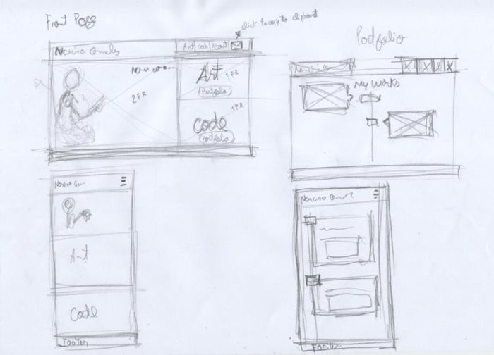
Every project that I create starts with paper and a pencil. For me these are still the best mediums to express an idea. So for my personal website i needed to create a list of content that i wanted to display. I started with Art, Design and an About page. If people wanted to reach me by e-mail i thought that the best idea would be to create a clickable button with the user could copy the e-mail (did this for security reasons).
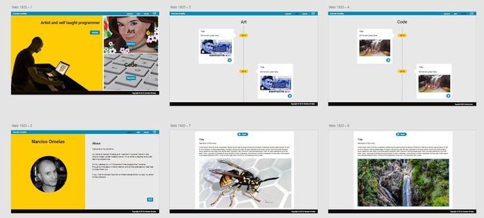
In the front page I placed a picture of my self and two big boxes with an image of one of my drawings or paintings, and the other for my front end projects. The portfolio has a timeline with some of my most important projects.
After this i went to watch some courses on lynda.com about UX, UI, CSS3, HTML5 and Javascript such as some Adobe tools. In the homepage i’ve made some changes in the order of the menu, the About page was now first, then Art and, in the end, Code. The other ideas stayed the same. Overall i wanted to be clear what the website was about. Then I started to sketch in Gimp and Inkscape (open source software) and Adobe XD, what would be the look of the final project.
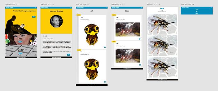
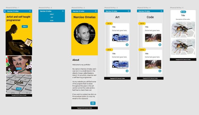
Even though I could have created personas for this project I didn't since i had some people to test the website, as I was building it. Some of them were proficient using the internet and applications, but others not really, so I created a good mix of people to review the website. All of them said that the website was ok, that they could get to the information, but there was something about the mix of colors that was not right and even the way the content was displayed, there was no way to go to another project without going back then choosing another and so on. The website was to simple and sometimes hard to use. Watch the result in the three next images.
PC version #
Tablet version #
Mobile version #
So, after the feedback, I had to do something. Watched more tutorials, read more articles, found other tools and ways to help me code, create content and work only in my favorite operating system which is Linux, ditching Windows aside for good.
This time i used the web based tool Figma, that is a nice option to Adobe XD.
In the front page I’ve added one more item to display “Design”. I’ve created another combination of colors making the website more pleasent to the eye, created new images, nem SVG buttons. The about page stayed pretty much the same but the Art, Code and Design pages went trough some changes. The articles in the timeline are now displayed in small cards, with a nice hover effect.
The way we read the articles is now much better visually, the user knows where he is all the time since I placed a big title text on the left corner of a small banner, the text as another font, the images where scaled and can now be displayed in a photo gallery, i gave up on the attribute srcset and only have a low res image for display on PC, tablets and mobile, and a hi res image for the photo gallery (thinking on the long term because i only have 100 megabytes on GitHub), the user can navigate much easier with the next and previous article buttons, there’s a back to top button and a button to share the article on Facebook at the end of the page.
Code page, is now separated in two parts, one is meant to display my front end projects and the other is for a “Technical documentation page” where i place tools, articles, tutorials and other content that helps me, or other people, with front end projects.
Overall i’ve used blue, wich according to Eva Heller (p. 21) in the book “ Psychology of Color”, is the favorite color. The yellow that, the color of otpimism, diversion, light and kindness, Eva Heller (p. 83). Arranged the content in a way that would make sense to the user to navigate, in a way that would be easy for him to reach the content that he wants. And created big buttons according to the Fitts Law “It’s faster to hit larger targets closer to you than smaller targets farther from you”.
Test the sketch that i’ve created in Figma below (only works on PC and tablets).
PC version #
Tablet version #
Mobile version #
Related content
Breathtaking Memories update to Eleventy and Forestry

Porto Locals website created with Eleventy

Clan Portugal Hill Climb Racing

FreeCodeCamp Web Design Certification
Opotours
Breathtaking Memories